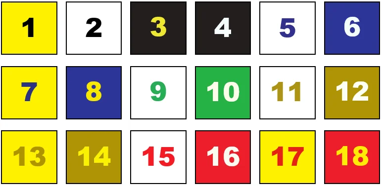
It is essential that outdoor designs are easy to read. Choose colors with high contrast in both hue and value. While colors with low contrast will blend together and obscure a message, contrasting colors are views well from great distances. In fact, research demonstrates that high color contrast can improve outdoor advertising recall by 38 percent.

A standard color wheel clearly illustrates the importance of contrast, hue and value. Opposite colors on the wheel are complementary. An example is red and green (as shown above). They represent a good contrast in hue, but their values are similar. It is difficult for the human eye to process the wavelength variations associated with complementary colors. Therefore, an optical distortion is sometimes detected when two complementary colors are used on top of one another.
Adjacent colors, such as blue and green, make especially poor combinations since their contrast is similar in both hue and value. As a result, adjacent colors create contrast that is hard to discern. Alternating colors, such as blue and yellow, produce the best combinations since they have good contrast in both hue and value. Black contrasts well with any color of light value and white is a good contrast with colors of dark value. For example, yellow and black are dissimilar in the contrast of both hue and value.
Interested in outdoor advertising? Contact us to learn more!
Source: OAAA